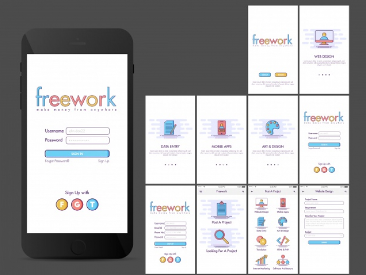
After enough research and knowing who your target user is, it’s time to think about how they’ll move through the app, making a list of screens
Is there a different path for a user who has to login compared to a user who skips the sign up process? Make a list of every screen you expect a user to encounter throughout their experience.
Take Instagram, for example. Here’s a list of all the screens you might encounter when logging into your account.
- Login
- Photo feed
- Comment view
- Share view
- Direct message list
- Message detail
- New message
- Search view
- Search results
- User profile
- Photo detail
- New post
- Filter view
- Edit view
- Comment and share view
- Activity feed – you
- Activity feed – following
- Profile
- Grid view
- List view
- Location view
- Tagged photo view
- Edit profile
- Options
- Invite
- Follow people
- Account settings
- Settings
- About
- Support
That’s a lot of screens, divided by top level navigation, sub screens, user management, support, and social settings. But even the most complicated app idea can be simplified by creating a user flow.
Once this has been done you can start creating the User Experience Flow Chart which will help to understand how your users will move through your app.


